
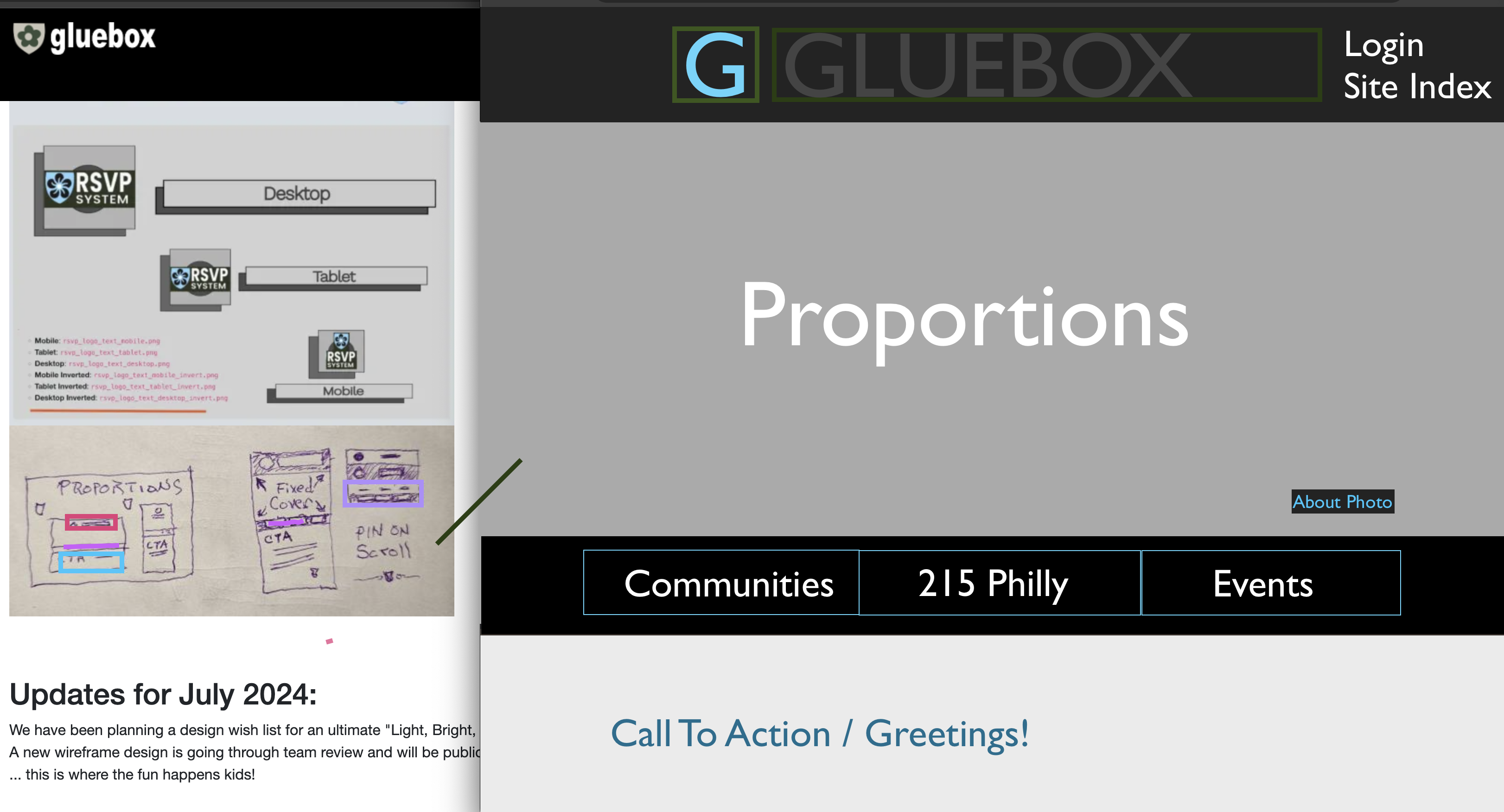
Target a structure and design for phones from the beginning.
Image
Image
Image
Phones are the way most human visitors will see your website.
Access Planning:
- SEO Search Engine and AI robot scripts
- Adaptive User Technology, screen readers
- Mobile Phones <-- AIM HERE
- Desktop/Tablets
- API Endpoint, IOT & other applications
Takeaways:
- Start with the mobile menu structure and work outwards.
- Menu items should be descriptive yet short, not boring.
- No more than six items. Keep the site menu short.
- Use the Footer area for less important "requirement" links and legal information.
"Policy links may be needed, but they're boring content and not part of our story."
Example A:
Google search results show a well-planned site structure.
Image

Protip:
Create descriptive text for key site sections. Carefully review and plan for a descriptive "Site Opener" message to convey an overall purpose for being. This is very helpful for SEO.
Each site section on the menu should have a descriptive text opener.
Example B:
A short "opener" message for a site section.
Image

Example C:
Search Results show a "Site Opener" message.
Image

Image
