
Year End Sprint:
RSVP System Theme:
https://github.com/slackstone/rsvp_system
Testing - removing depreciated requirements Single Directory Components 'drupal:sdc'
Updates for September 2024:
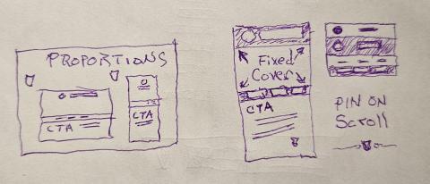
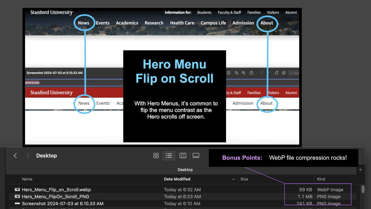
Design Specification for Logo and Site Name "Flip on Scroll" Inversion Effect
Overview
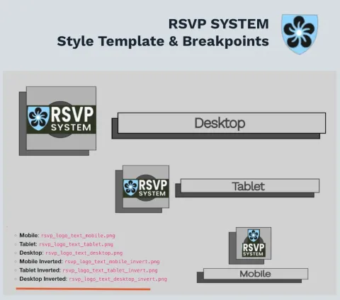
A key theme design concept focuses on implementing a "Flip on Scroll" inversion effect for the theme's Logo and Site Name. This effect dynamically swaps between standard and inverted images based on scroll position, enhancing the visual experience. The setup utilizes two <picture> elements—one for the Logo and one for the Site Name—with a total of 12 image files organized by device type and effect state.
Media Breakpoints
The design accommodates three device types, each with specific media breakpoints:
- Mobile: Up to 599px
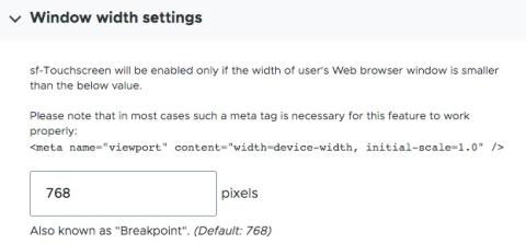
- Tablet: 600px to 1024px // Hamburger @ 768px
- Desktop: 1025px and above
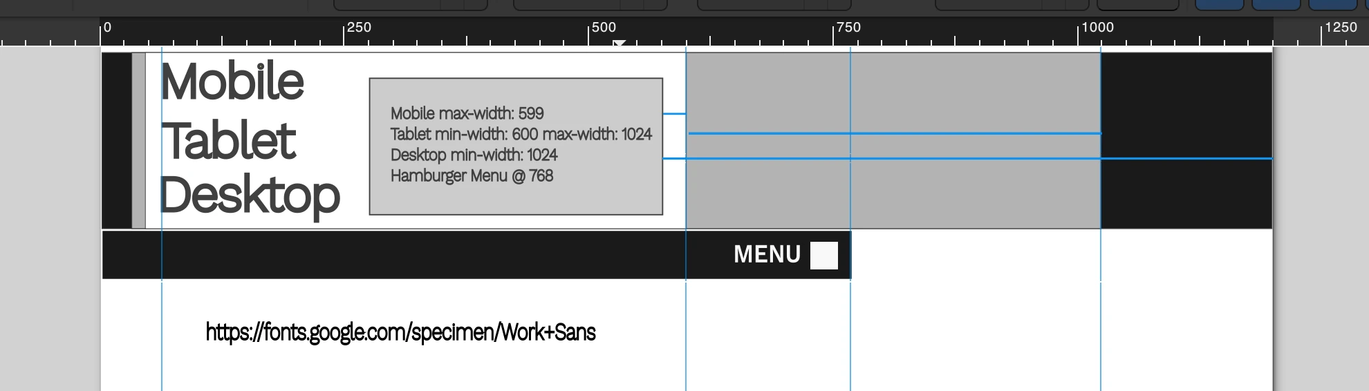
Each breakpoint has a standard and an inverted (scroll) version of the Logo and Site Name images.
The hamburger navigation menu breakpoint is probably 768px. Tablets may display phone navigation if they are on the smaller side.
Image Files Organization
A total of 12 images are used, covering all device types and states:
Logo Images
- Mobile:
rsvp_logo_mobile.png - Tablet:
rsvp_logo_tablet.png - Desktop:
rsvp_logo_desktop.png - Mobile Inverted:
rsvp_logo_mobile_invert.png - Tablet Inverted:
rsvp_logo_tablet_invert.png - Desktop Inverted:
rsvp_logo_desktop_invert.png
Site Name Images
- Mobile:
rsvp_logo_text_mobile.png - Tablet:
rsvp_logo_text_tablet.png - Desktop:
rsvp_logo_text_desktop.png - Mobile Inverted:
rsvp_logo_text_mobile_invert.png - Tablet Inverted:
rsvp_logo_text_tablet_invert.png - Desktop Inverted:
rsvp_logo_text_desktop_invert.png
SVG Template for Image Creation
To maintain consistency and streamline the customization of the image sets, an SVG Template (rsvp_logo_media_template.svg) is provided. This template includes the layout guides for all image versions, making it easy to generate correctly sized and positioned images. Designers should use this template to create custom sets that fit the theme.
Implementation Notes
- Usage of
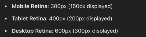
<picture>Tags: Each<picture>element serves the appropriate image based on the screen size usingsrcsetattributes with media queries. - Image Sizes: Recommended sizes based on target devices are:
- Mobile: ~150px wide
- Tablet: ~200px wide
- Desktop: ~300px wide
- Retina Support: Images are saved as double resolution (2x) to ensure crisp visuals on high-DPI screens.
<!-- Picture element for the Logo -->
<picture>
<source srcset="path/to/rsvp_logo_mobile.png" media="(max-width: 599px)">
<source srcset="path/to/rsvp_logo_tablet.png" media="(min-width: 600px) and (max-width: 1024px)">
<source srcset="path/to/rsvp_logo_desktop.png" media="(min-width: 1025px)">
<img src="path/to/rsvp_logo_desktop.png" alt="RSVP Logo" style="width: auto; height: auto;">
</picture>
<!-- Picture element for the Site Name -->
<picture>
<source srcset="path/to/rsvp_logo_text_mobile.png" media="(max-width: 599px)">
<source srcset="path/to/rsvp_logo_text_tablet.png" media="(min-width: 600px) and (max-width: 1024px)">
<source srcset="path/to/rsvp_logo_text_desktop.png" media="(min-width: 1025px)">
<img src="path/to/rsvp_logo_text_desktop.png" alt="RSVP Site Name" style="width: auto; height: auto;">
</picture>
Info Alert Severity:
Red - High Visibility
Gold - Special Announcement
Blue - Info Note
Green - All Clear
Updates for July 2024:
We have been planning a design wish list for an ultimate "Light, Bright, and Open" theme.
A new wireframe design is going through team review and will be publicly released later this month.
... this is where the fun happens kids!

Updates for June 2024:
The repository is now updated to Radix 6.x for Drupal 10.3.x
The theme is rebranding into "Radix RSVP System Theme" to better align with the RSVP System project.
https://github.com/slackstone/radix_house_theme
Updates for May 2024:
Stay tuned for a quick mess in our project Repository, we're about to blow things out and reset for Radix 6 . Radix 6 Beta is build on top of Drupal's new Single Direcotry Components. This is a creamy butter-like feature that we're really excited to use in our projects.
Radix House Theme is a professional "Sub" Theme, based off of Radix Bootstrap Drupal Theme; Version 6.
Project Link : Github.com/slackstone/radix_house_theme )
Radix was chosen for it's flexibility in creating quick sub-themes. Radix is a mature project that runs in production for many large institutions.
Technical Explanations & Random Notes
A Pattern Library example page.
Builds on Atomic Design is a methodology.
Drupal 10.x now has an easy way to toggle Theme debugging, see:
/admin/config/development/settings
For Drupal 9, you can set theme debugging in the settings.php, or services.yml.
Twig TweK Cheat Sheet
Menu Systems Tools of Choice for 2024
SuperFish - Menu Navigation
StickyNav - Mobile Layout
SuperFish for our site menus, with a mobile breakpoint of 768px.
https://www.drupal.org/project/superfish
It's helpful to know that some Menu CSS may live outside of the Theme CSS.
Keep an eye out for CSS that is found within the Module.
Schema Matters
Experience tells us that enforcing a planned schema pays big dividends.
https://schema.org/ Enforcing a common schema reduces redundancy and confusion, while increasing flexibility with other systems.
"Your site schema is your site foundation, plan it well. "